Case Study 09Delivery model · Reporting
The Dashboard Nobody Opens: Why QA Tooling Has a Delivery Problem
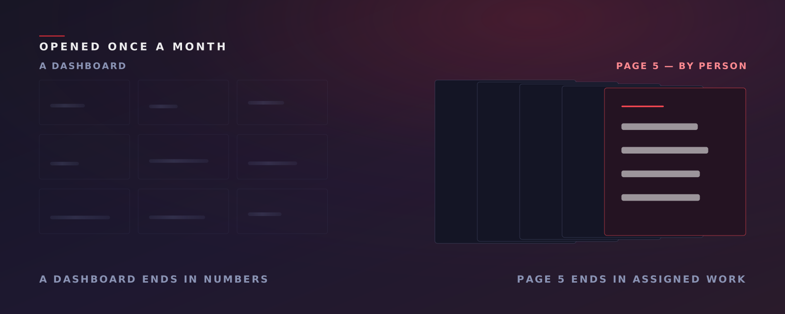
Most conversation-intelligence platforms output a dashboard. Dashboards require a login, a mental model, a training session and a habit — and contact centre leadership has none of those to spare. This case study is about making the deliverable a document that ends in assigned work.
- Mon 11am
- IST, every week, as a PDF
- 48h
- SLA from batch close
- Page 5
- assigned work, by person
- Never
- how often the two scores blend
Key findings
- A dashboard requires a login, a mental model, a training session and a habit. Operations leadership has none of those spare.
- Dashboards end in numbers, and numbers do not assign work. The gap between a score and an instruction is a human translation step nobody has time for.
- Producing a written, prioritised deliverable every week is an operations discipline, not a software one — which is why software companies build dashboards instead.
- The report and the application must reconcile to the digit, or they become two competing sources of truth.
A delivery problem, not an analysis problem
There is a failure mode in this category that has nothing to do with how good the analysis is.
The output of most conversation-intelligence platforms is a dashboard. A dashboard requires four things from the person who is supposed to use it: a login, a mental model of what the charts mean, a training session to build that model, and a habit of returning.
Contact-centre operations leadership has none of those to spare. So the outcome is predictable and it is almost always the same: the platform is bought by a QA head, used intensively for about six weeks, and then opened once a month, twenty minutes before the review meeting, to screenshot two charts.
The analysis was fine. Nobody read it.
The second problem: numbers do not assign work
Even when the dashboard is opened, it ends in numbers.
Opening score is 62%. That is a true statement about the floor and it is not actionable by anyone. Somebody now has to work out which agents are pulling it down, on which skill, whether it is a training issue or a script issue, who owns fixing it, and by when.
That translation step — from “opening score is 62%” to “Priya needs coaching on identity verification before Thursday” — is done by a human, from a dashboard, in time nobody has allocated. So it happens for the worst two agents and nobody else, or it does not happen at all.
A dashboard tells you the floor has a problem. It does not tell anyone what to do on Monday.
Why software companies build dashboards anyway
Because building a dashboard is what software companies know how to do.
Producing a written, prioritised deliverable every week is an operations discipline, not a software one. It needs analysts, a cadence, a service level, and someone accountable when Monday comes and the document is not ready. That is a service business wearing a software business’s clothes, and it does not fit the margin structure most vendors are funded against.
So the industry ships the artefact it can build cheaply and leaves the last mile — the part where the analysis becomes work — to the customer.
What we changed: the deliverable is a document
The primary deliverable is a PDF, not a screen. A prioritised weekly report lands at Monday, 11am IST, inside a 48-hour SLA from batch close, and the last page is an assigned task list — owner, behaviour to coach, due date.
The report ends in assigned work rather than more numbers to read.
Two structural decisions stop this from being a dashboard export with extra steps.
1. Two scoring systems, side by side, never blended
Page 3 is the analyst’s five PASS / MINOR / FAIL quality perspectives. Page 4 is the platform’s arithmetic — opening, handling, closing, call score, calls against goal, silence.
The report deliberately refuses to merge them:
These never blend into one number.
So a reader can always see which kind of problem they have. A low analyst grade with a healthy call score is a conduct issue. A healthy grade with a low call score is a process issue. One blended number would have destroyed that distinction to save a column. (This is the same principle described in Two Supervisors, Two Scores.)
2. The report reconciles with the application, to the digit
This sounds like an implementation detail and is actually the decision the whole model rests on.
The report’s scoring formulas are ported verbatim from the platform’s own code, each attributed to the source it came from, with assertions enforcing the locked bucket sizes. Where the date-filtering design had to choose between mirroring the pipeline’s internal view and mirroring what the dashboard shows, it chose the dashboard — so the report reconciles with what leadership already sees.
That is the opposite of the usual engineering instinct, which is to be faithful to the system’s own view and explain the discrepancy. The discrepancy cannot be explained at scale. If page 4 of the PDF disagrees with the screen by two points, you now have two sources of truth and a standing argument, and the PDF loses.
And the application is still there
This is where we would push back on our own positioning. “No software to learn” is true about what we ask of you, and it is not the whole picture.
Teams that want to work the data get a full application: waveform playback, transcript with click-to-jump, fifteen chart types, a saved multi-clause filter builder that can be shared to teammates, bookmarks, comments with @-mentions routed to Slack, and XLSX export.
The honest framing is a report for the people who need an answer, and an application for the people who need to dig. The PDF is the default because most weeks most people need an answer. The application is the depth, for the weeks when they do not.
What we do not claim
We do not claim dashboards are useless. We claim they are a poor default, because the default has to work for the person with the least time, and that person is usually the one who decides whether the programme continues.
We do not claim you will never log in. Some of your team will, often. The claim is that nothing important requires it.
We do not claim the report generates itself. It does not — reports are produced and delivered by our analyst team as part of the plan, and there is no button in the application that generates one. That is a real constraint on how fast we can grow, and it is the reason the document is worth reading when it arrives.
Where to start
Check your current tool’s login records for the last quarter. Not licences issued — logins, by person, by week.
The shape of that data usually settles the question faster than any feature comparison.
Book a demo and we will walk you through a real weekly report, including the page that ends in assigned work.
Related: A Score Is Not an Instruction on what has to be in that assigned work, and Software That Needs a Team You Do Not Have on the delivery model behind it.
Curious what is in the 95% you never hear?
Book a demo and we will walk you through the platform — how the reviews work, what the reports contain, and how the evidence trail is built.
Book a Demo